Imagery
Imagery
The imagery associated with EPI-USE not only strengthens the brand, but also conveys non-written values to the world. This powerful visual representation not only captures attention but also leaves a lasting impression.
The consistent use of these visuals across various platforms and channels further reinforces the brand image and fosters a sense of trust and recognition among the target audience. In addition, it showcases the company's commitment to quality and professionalism.


Core categories
Keeping these categories focused, increases our brand recognition. A curated library will be made available to staff.

Elephants
Elephants are the most recognisable symbol of the brand. Specifically, only the African Elephant (Loxodonta Africana) is used and no other species of elephants are permitted. The images feature elephants in their natural habitat, moving freely and untouched by humans. The guidelines for using elephants are strict and will be further reinforced to strengthen the brand. Elephants also serve as a connection between EPI-USE and the larger group it belongs to, groupelephant.com.

People
Incorporating human imagery plays a pivotal role in fostering a visceral connection with our audience. The presence of people should communicate warmth and approachability. It also reinforces the trustworthiness and accessibility of our brand’s identity. Through our aspirational yet authentic representation of people - our brand extends an invitation for all to find their place within our narrative.

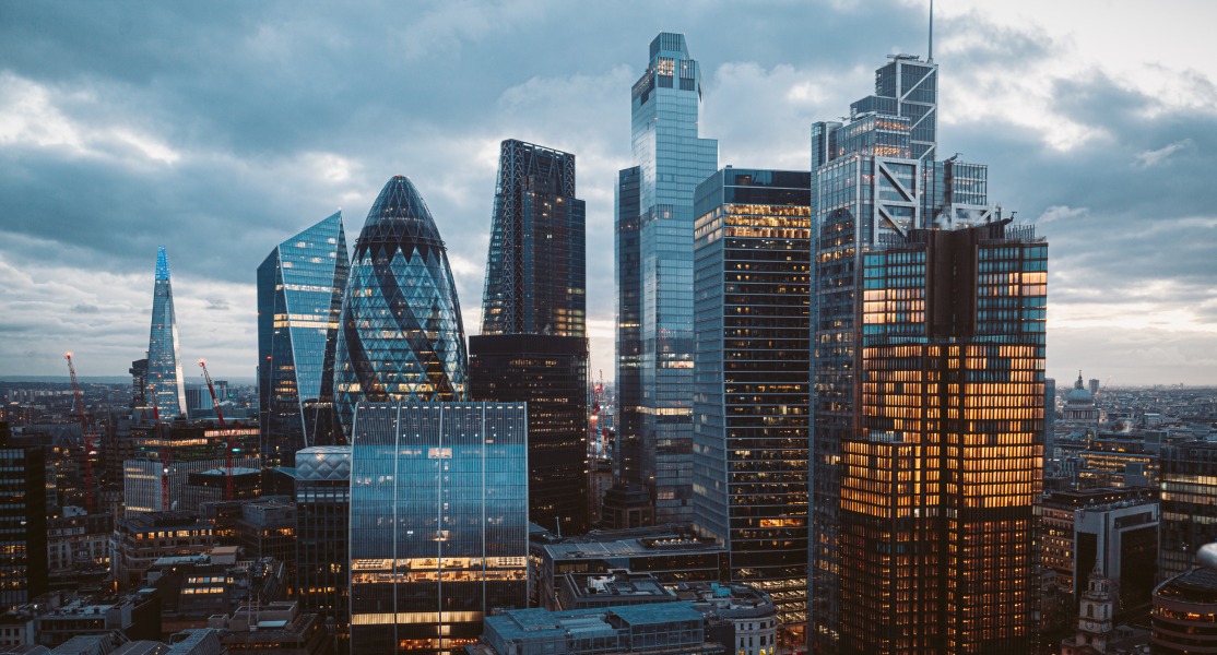
Cityscapes
Cityscapes within our brand guide are not just background elements; they are a powerful visual statement underscoring our expansive global presence. These panoramic views of urban horizons reflect our brand's pulse within the arteries of the world’s most dynamic cities. They ground our identity in the context of a global stage, highlighting our reach and relevance across diverse cultural landscapes. By showcasing various metropolitan backdrops, we not only celebrate the diverse locations where our brand takes root but also demonstrate our commitment to being a globally recognised and trusted entity. The cityscape is a testament to our integration into the fabric of international commerce and our capacity to serve and resonate with clients on a worldwide scale.
Additional categories
In addition to the above core visuals, additional guidelines exist for 3 additional categories to support the wide range of communication.

Diagrams
At times, communicating through diagrams are important to contextualise and clarify important concepts. They function as both an informative and efficient means of communicating complex information, distilling it into easily digestible visual formats. Clear guidelines are available, and formal assistance is also available.

Technology
When infusing technology imagery into our brand guide, it is imperative that we exercise a measured approach. Rather than inundating our visuals with generic technological elements, we opt for a curated selection of recognisable and pertinent technological symbols that align with our brand's core values and offerings. This deliberate restraint ensures that each technological image is impactful, reinforcing our sophisticated use of enterprise solutions.

Industry specific
For case studies surrounding our clients, we do use imagery that are industry specific.
General image guidelines
The correct use of imagery can easily be diluted by unintentional mistakes or well-intentioned adjustments. In 2024, the guidelines will become stricter to enhance the brand strength of EPI-USE. Because there are numerous scenarios in which images are used, far beyond what our image library might support, guidelines are of utmost importance.

Do not create a harsh gradient that interferes with the original image in order to create copy space. Gradients can be used subtly to extend space for copy but should not create a visual disturbance or overwhelm the scene.

When introducing copy in combination with an image, ensure that there is enough space for the copy. If there isn't, consider selecting a different image.

Do not create a gradient that interferes with the original image in order to create copy space.

Do not mask images into other shapes.

Combining holograms with images is not recommended. This improper use of technology styles can lead to inconsistent styling.

No filters or colour grading should be applied. The images in the provided image gallery may include colour graded options, but those will be the only approved scenarios.

Do not use overlays on images except for the colour Midnight blue or a greyscale conversion. These exceptions should be applied sparingly.

No blurry images. Blurriness is often caused by printing low-resolution images incorrectly or using low-resolution images.

Do not include images that have highly visible text, as they interfere with our branded fonts, scaling, and translation capabilities.

Avoid using images with double exposure. This is not allowed under any circumstance.

Textured filters such as the bokeh effect should never be applied to images.
Always here to help
Maintaining EPI-USE’s brand integrity across all marketing communications is crucial, and we are dedicated to supporting you in this endeavour.


